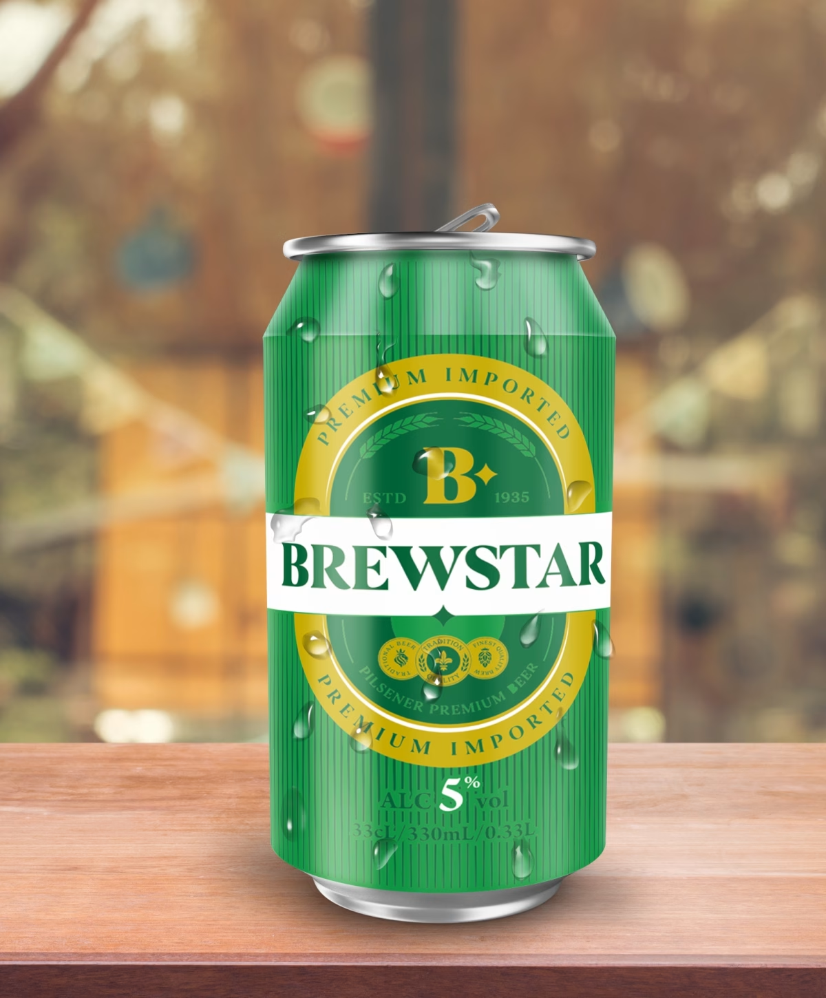
The Brewstar can design was an exercise in balancing visual impact, brand expression, and the technical constraints of aluminum can printing. In a highly competitive beer market dominated by major players, our goal was to create a packaging design that stands out on the shelf while clearly expressing the character of a Belgian premium beer.
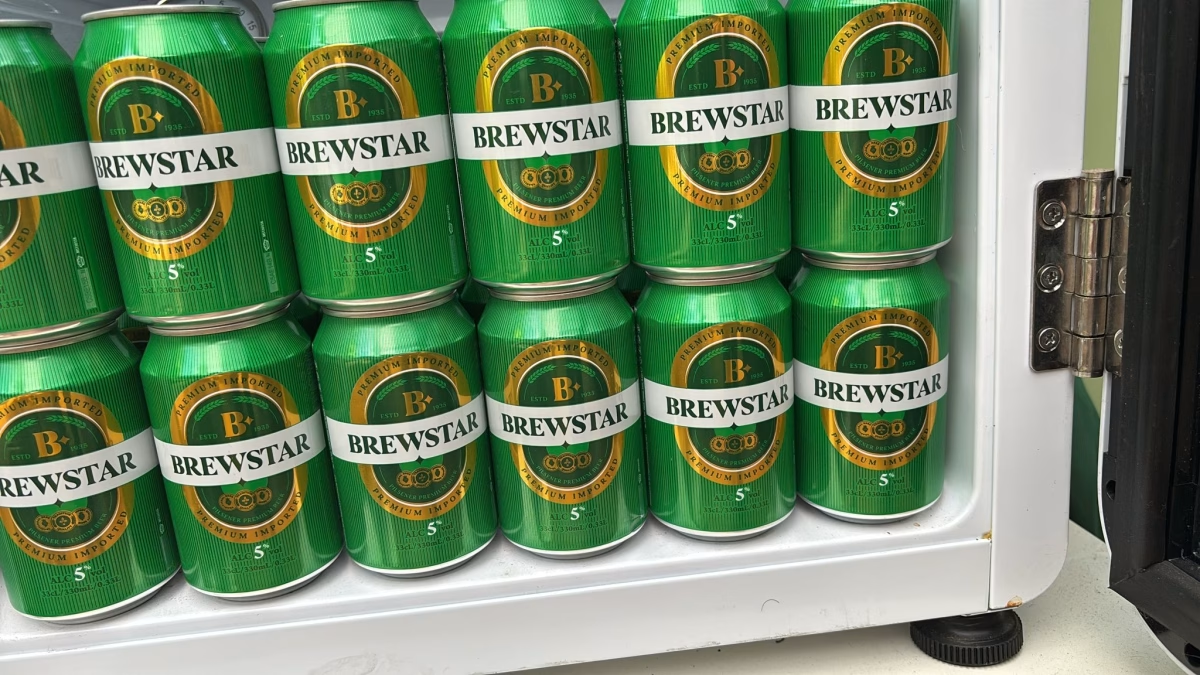
The process began with a deep understanding of the product’s retail environment - how it appears on shelves, in fridges, and in the consumer’s hand - as well as the limitations and requirements of aluminum can printing. We developed a visual system that works both from a distance and up close, using strong contrasts, bold graphic elements, and a clear visual hierarchy.
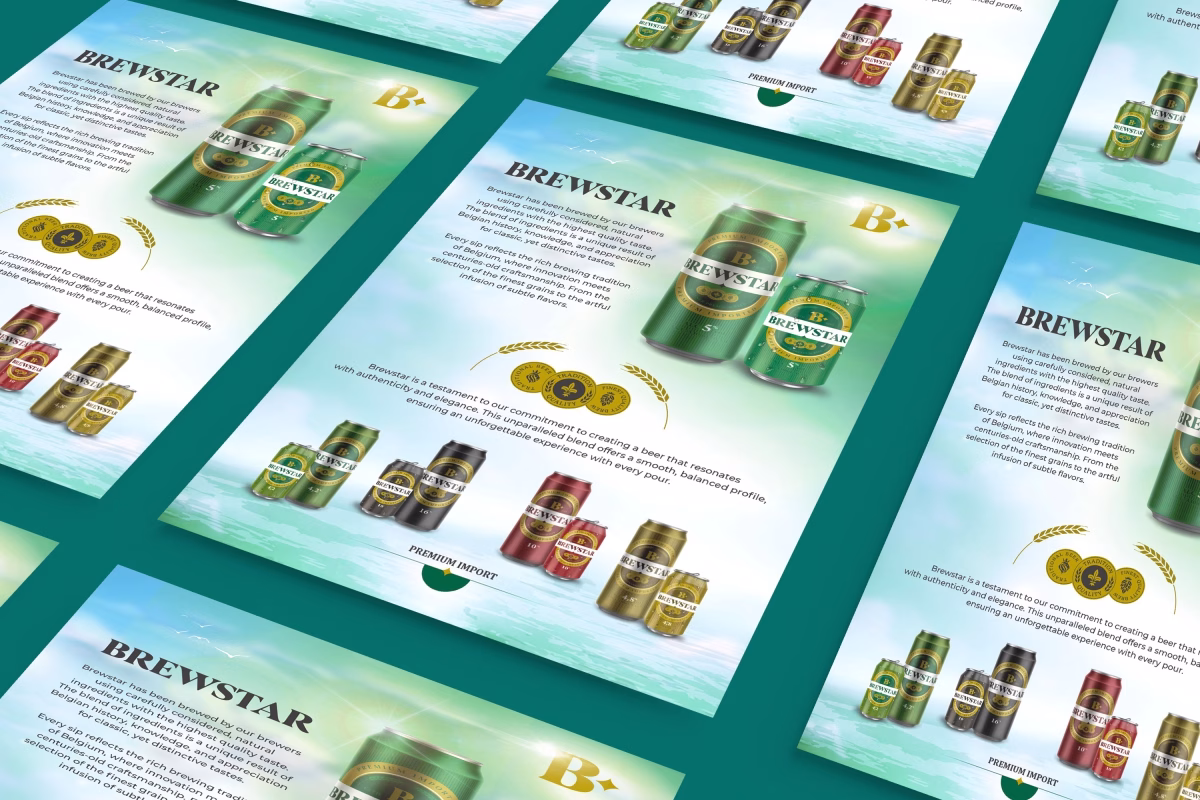
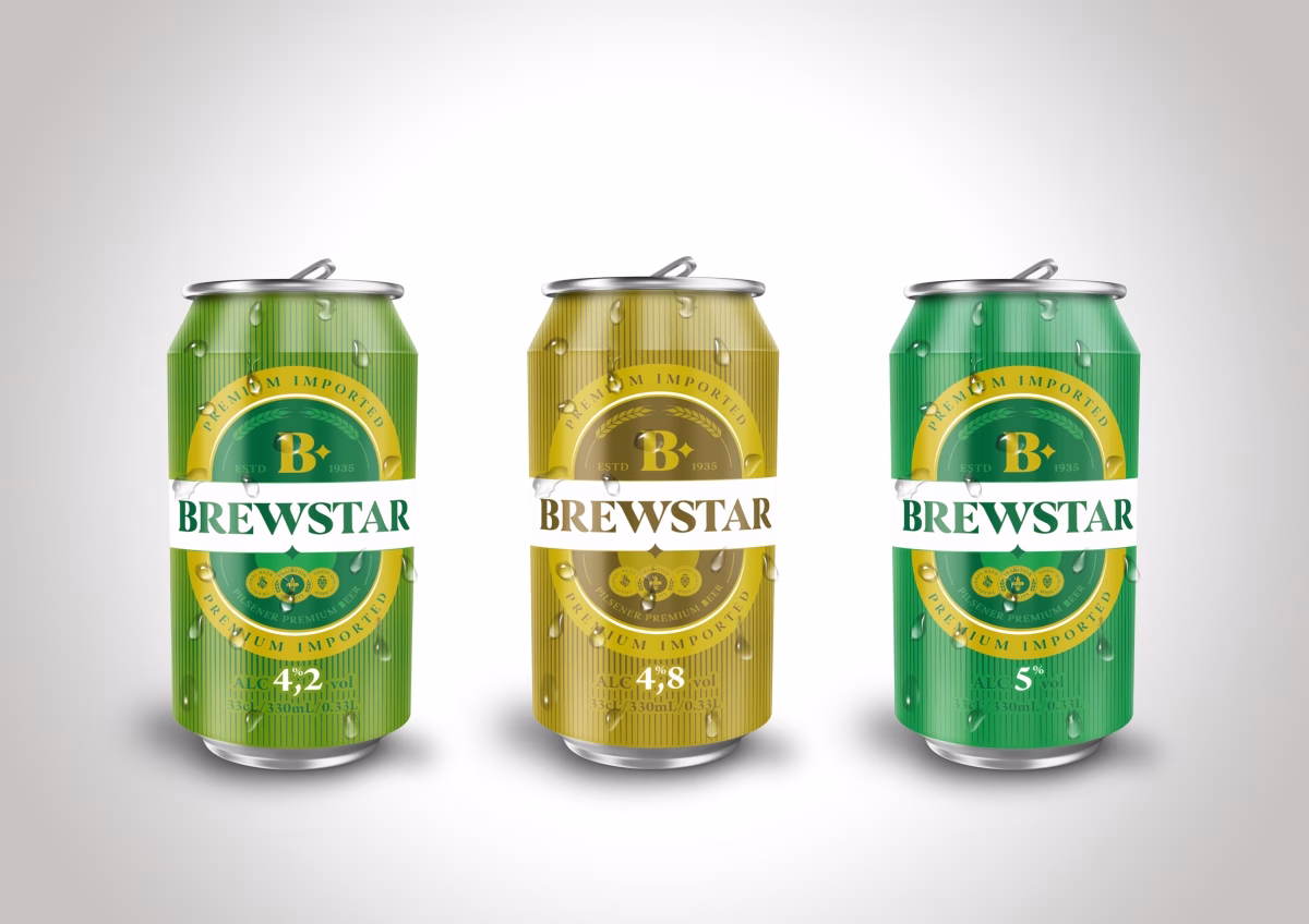
The Brewstar identity was designed as a flexible universe, able to expand across multiple beer varieties without losing consistency. Each variant has its own color and graphic personality, while all of them share a recognizable visual signature that reflects the spirit of Belgian beer: tradition, character, and refinement.
The result is a modern, distinctive packaging design that performs effectively in retail environments and turns every Brewstar can into a strong visual statement of the brand.