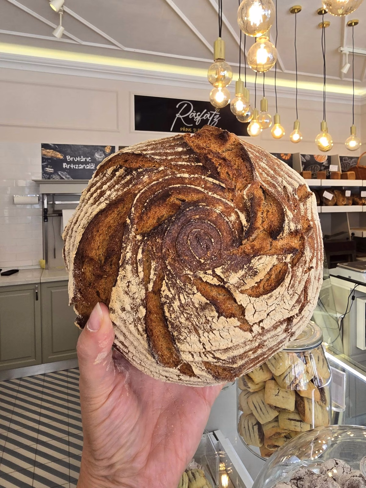
The visual identity of Răsfătz was built around the very essence of the brand: respect for bread made with patience, clean ingredients, and artisanal craftsmanship. Every visual element was designed to reflect not just a product, but a feeling - the authentic sense of indulgence that comes from enjoying a truly good loaf of bread.
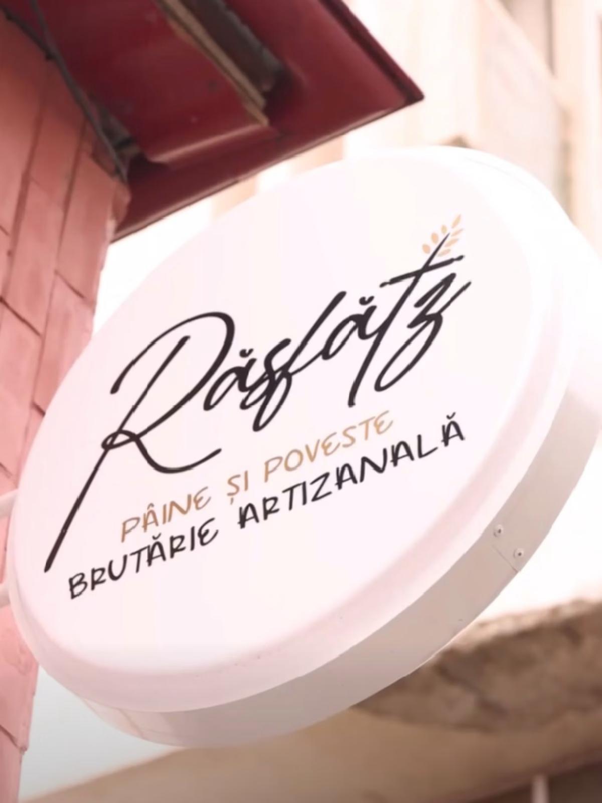
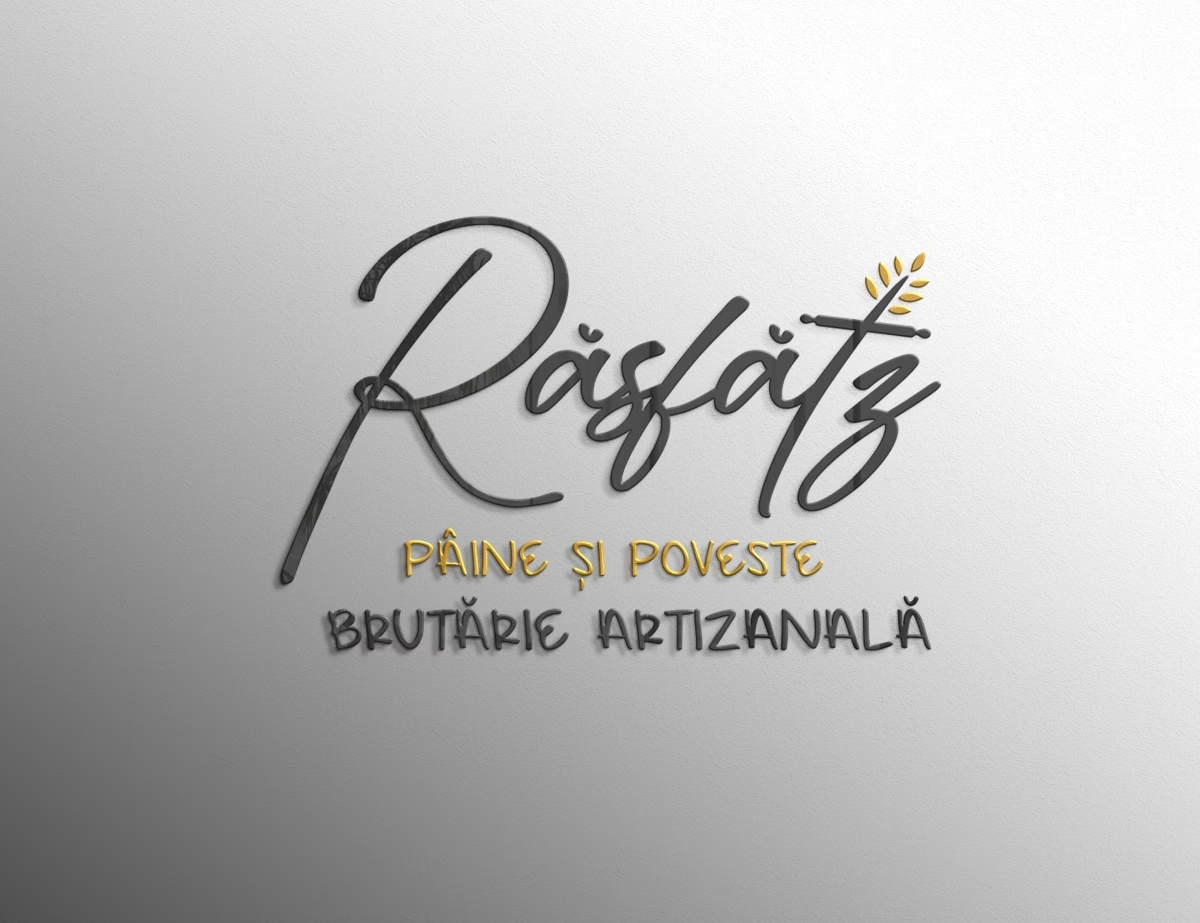
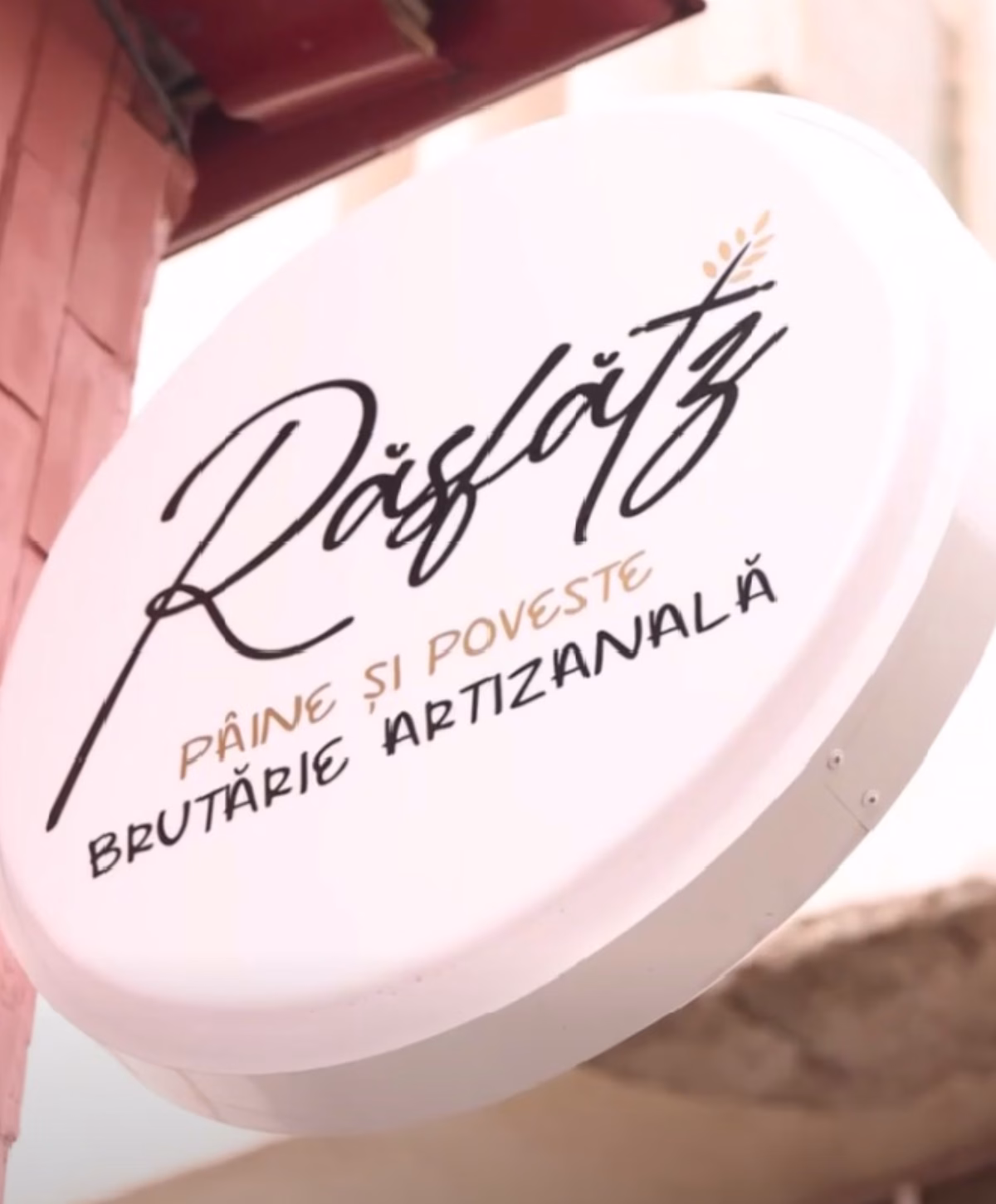
The logo became the core of the entire visual system. We chose an elegant, modern script typeface to evoke the natural flow and softness of kneading dough, paired with meaningful bakery symbols: the rolling pin and wheat ears. Together, they tell the story of bread’s journey - from grain to dough, and from careful shaping to the warmth of the oven.
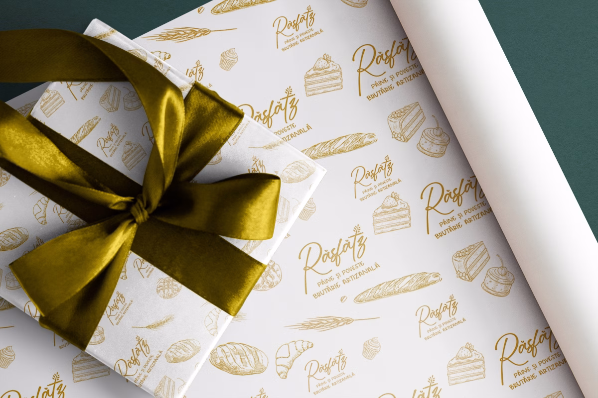
The color palette speaks of simplicity, purity, and minimalist refinement, inspired by natural ingredients and the textures of flour, wheat, and freshly baked bread. These tones support the brand’s message of honesty, quality, and balance.
All visual applications - from packaging and labels to communication materials - were designed as extensions of this story. Every detail conveys the care, patience, and passion behind each Răsfătz product.
The result is a warm, cohesive visual identity that turns the brand into an experience as pleasing to the eye as its bread is to the taste.