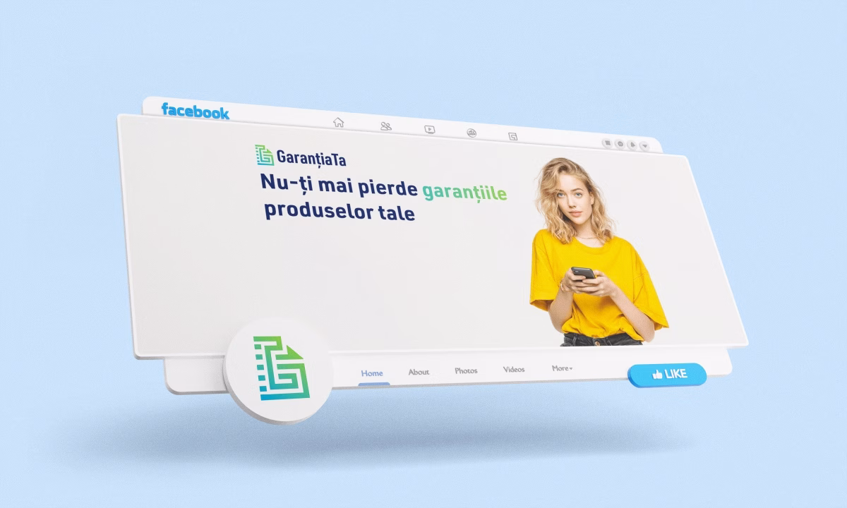
Who hasn't frantically searched through drawers and folders for a warranty, only to discover it expired a week ago? GaranțiaTa is the Romanian app designed to solve this universal frustration — a digital platform where users can save and organize their product warranties, with notifications before they expire.
Alexandru-Fabian Sava, the founder of GarantiaTa.ro, came to us with a clear vision: an app that eliminates the stress of physical documents, starting with warranties. He knew he was launching with a website, but he already had plans for a mobile app and, eventually, a presence at industry events.
That clarity made all the difference.
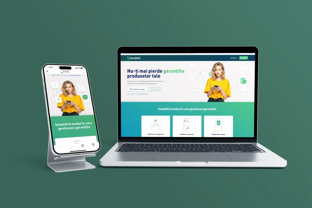
Our challenge was to create a brand identity that would work across all these contexts without needing to be reinvented each time. We weren't designing for today's website alone — we were designing for tomorrow's app and next year's expo booth.
We want to share a few lessons from this process. Things we wish we'd known early in our careers, and that any entrepreneur can apply when building their brand.
Summary
- Why Investing in Visual Identity Early Actually Saves Money
- How the GaranțiaTa Logo Came to Life
- The Psychology Behind the Color Palette
- Designing for an App That Doesn't Exist Yet
- Why We Chose a Photograph Over an Illustration
- How to Avoid Typography Surprises
- Where to Start If You Have a Limited Budget
- Instead of a Conclusion
Why Investing in Visual Identity Early Actually Saves Money
We often see startups begin with a quick logo, just "to have something." It's a natural impulse. You have a thousand priorities, a tight budget, and you want to launch as fast as possible.
The problem? Two years later, you're redoing everything.
We've seen this play out countless times — the founder has new goals, wants to attend a conference, print business cards, launch an app — and realizes their logo looks pixelated when enlarged, the colors print differently than expected, and the font isn't licensed for commercial use. They end up paying twice for the same work.
When you build it right from the start, you're building a foundation. Not just a logo—a system that works on any medium.
How the GaranțiaTa Logo Came to Life
We started with the app's essence: organization, security, simplicity. We explored several directions: shapes suggesting documents, shield icons for protection, and more abstract variations.
The final logo, that stylized "G", combines multiple ideas: the outline of a folder or document, the concept of organization, and the brand's initial letter.
The test we always apply: a logo must be simple enough to be recognizable at very small sizes, yet distinctive enough to work on a 6-foot roll-up banner.
GaranțiaTa passes this test.
The Psychology Behind the Color Palette
GaranțiaTa's color palette is dominated by teal green and navy blue. This wasn't a random choice.
Green, in this teal shade, has a universal association: validation, confirmation, "everything's okay." Think of the green checkmarks in any app. When users see green, they subconsciously feel their warranties are safe. It's a psychological choice, not just an aesthetic one.
Navy blue adds a layer of professionalism and trust. It's stable, serious — important for an app you're entrusting with personal documents.
The combination also works practically: the contrast is strong, the text is easy to read, and the colors translate well both on screen and in print.
You might also want to read this:
- Herbal Lion: De la viziune de brand la design de etichetă premium
- Case Study: “La Petreuș” or How Authentic Design Powers Business Growth
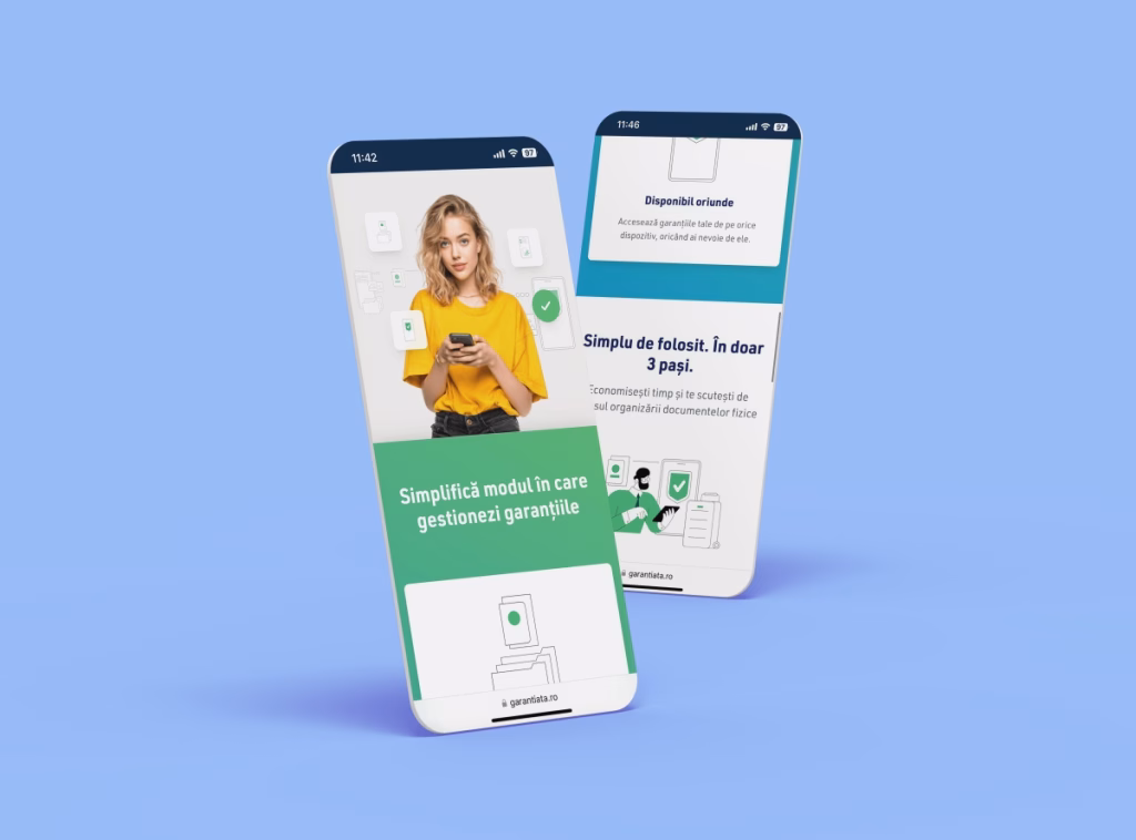
Designing for an App That Doesn't Exist Yet
When we worked on GaranțiaTa's identity, the mobile app was still just a plan. But we designed as if it were already in development.
What does that mean in practice?
We thought through every visual element with the question: "Does this work at 24 pixels?" The logo has a simplified version — just the "G" symbol — for tight spaces. The website icons are created in vector format, so they can be used identically in the app without redesign. The color palette is tested for contrast and accessibility, including for a potential dark mode.
In practice, when the app developer starts work, they'll have all the visual assets ready. Zero delays, zero additional costs for "adaptation."
Why We Chose a Photograph Over an Illustration
On the website's hero section, there's a photo of a real person. We debated this decision extensively as a team.
Flat illustrations are very popular in tech and would have been consistent with the icons we created. But for an app that manages personal documents, we felt a real human element was necessary.
A real person communicates: "This is for people like you, not just tech enthusiasts."
A detail you might not have noticed: the yellow shirt worn by the person in the image isn't accidental. Yellow brings warmth and energy to an otherwise "cool" palette (green, blue, white). It creates a balance between human and technological.
These seemingly small decisions make the difference between a brand that "looks good" and one that actually communicates.
How to Avoid Typography Surprises
Many digital brands run into problems when they move to physical materials. Colors look different, the logo prints blurry, and nothing resembles what they see on screen.
The solution? Clear specifications from the design phase.
When we deliver a project, we don't just hand over logo files. We deliver a mini-guide that includes exact color codes for screen (RGB, HEX) and for print (CMYK, Pantone). It includes spacing rules, minimum sizes, and variations for light or dark backgrounds.
This way, when the entrepreneur goes to a print shop for business cards or a large-format printer for banners, they have all the information needed to ensure the result looks exactly like it does on screen.
For GaranțiaTa, we prepared all these specifications from the beginning, knowing Alexandru would need physical materials for events.
You might also want to read this: Complete Guide for Unified Online and Offline Branding
Where to Start If You Have a Limited Budget
We understand that not everyone has the budget for a complete visual identity from day one. If that's your situation, here's the priority:
Invest at least in a professional logo with basic specifications: vector files (AI, EPS, SVG), documented color codes, and a font licensed for commercial use.
The rest (elaborate icon sets, extended brand guidelines, social media templates) can come later as the business grows.
But the foundation needs to be solid. It's much easier to build on a good foundation than to demolish and rebuild.
You might also want to read this: How to Collaborate with a Logo Designer: The Complete Guide for Entrepreneurs
Instead of a Conclusion
The GaranțiaTa project confirmed once again that branding isn't about aesthetics. It's about strategy. A beautiful logo that doesn't work in all necessary contexts is just a pretty picture. A well-thought-out brand system is an investment that saves you time and money. We hope the insights from this project are useful to you. If you have questions about branding or want to discuss your project, get in touch.
