Company Med, a company with 100% Romanian private capital, founded in 2007 and now employing over 250 highly trained professionals, stands as a strong example of growth driven by professionalism, quality and long-term international partnerships. As the company expanded and increasingly targeted international markets, the need arose for a brand identity that could accurately reflect its maturity, stability and technological expertise.
The rebranding process began with an in-depth analysis of Company Med’s positioning and its strategic goals for international development. The main objective was to create a modern, distinctive and globally relevant visual identity aligned with the standards of the electronics and automotive manufacturing industries.
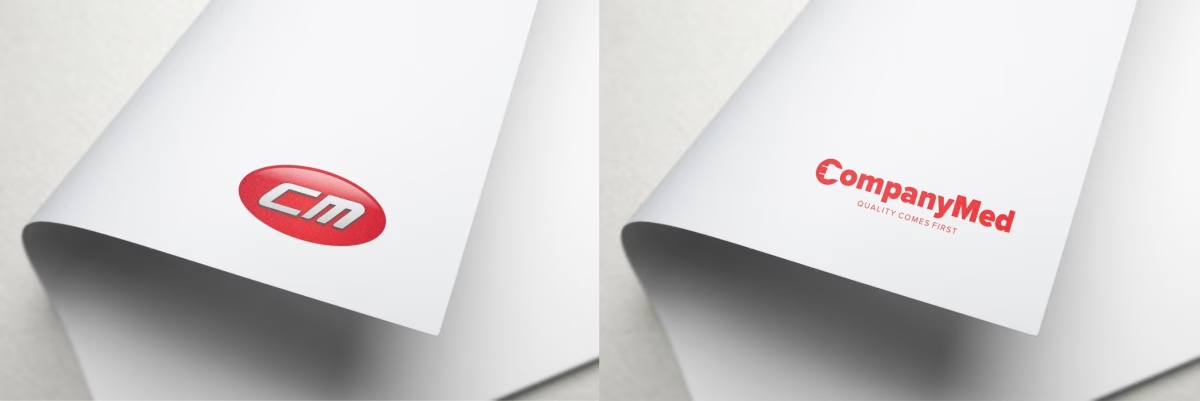
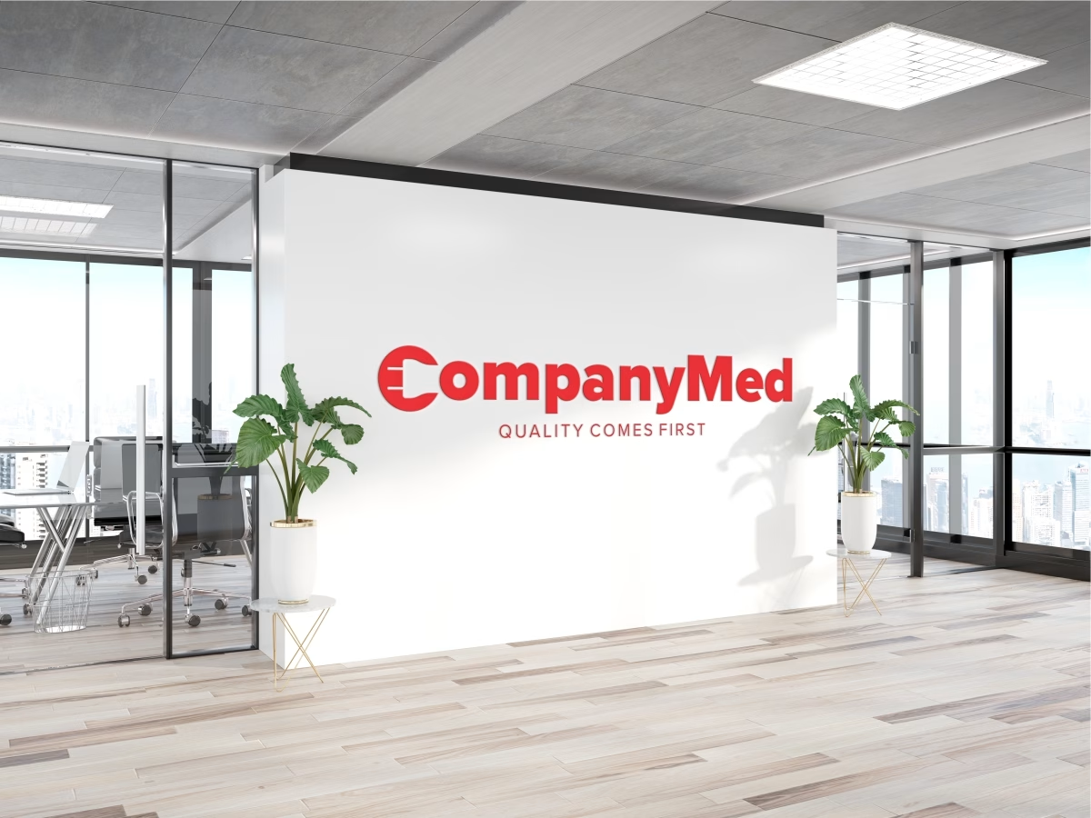
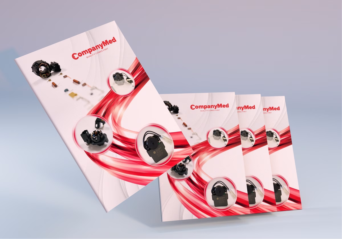
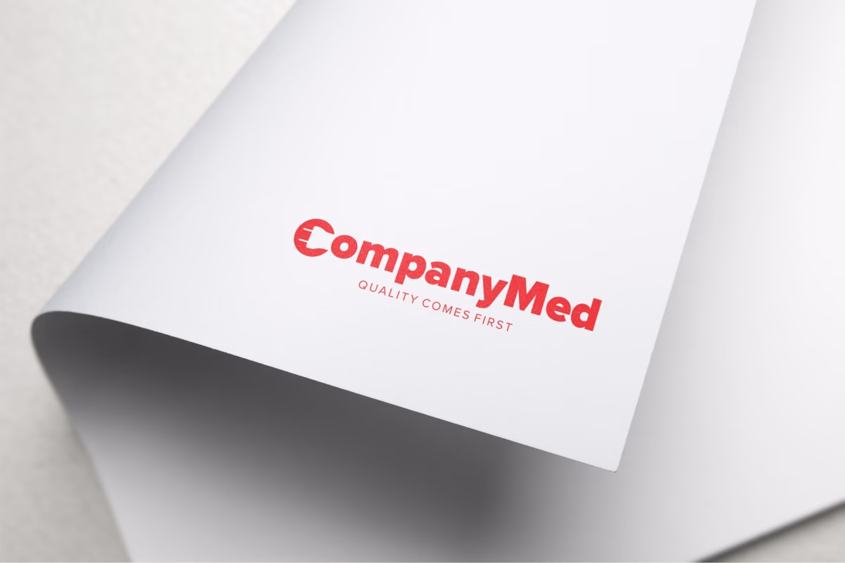
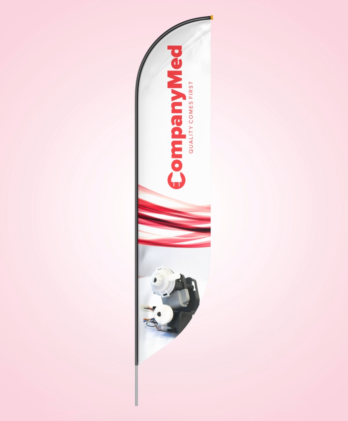
The logo was redesigned while preserving the original brand colors in order to maintain continuity and recognition. Its form was significantly simplified to improve clarity, versatility and digital performance. The letter “C” was transformed into a key visual element by integrating a universal symbol inspired by electronic assemblies, directly referencing Company Med’s core expertise.
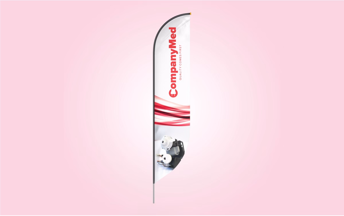
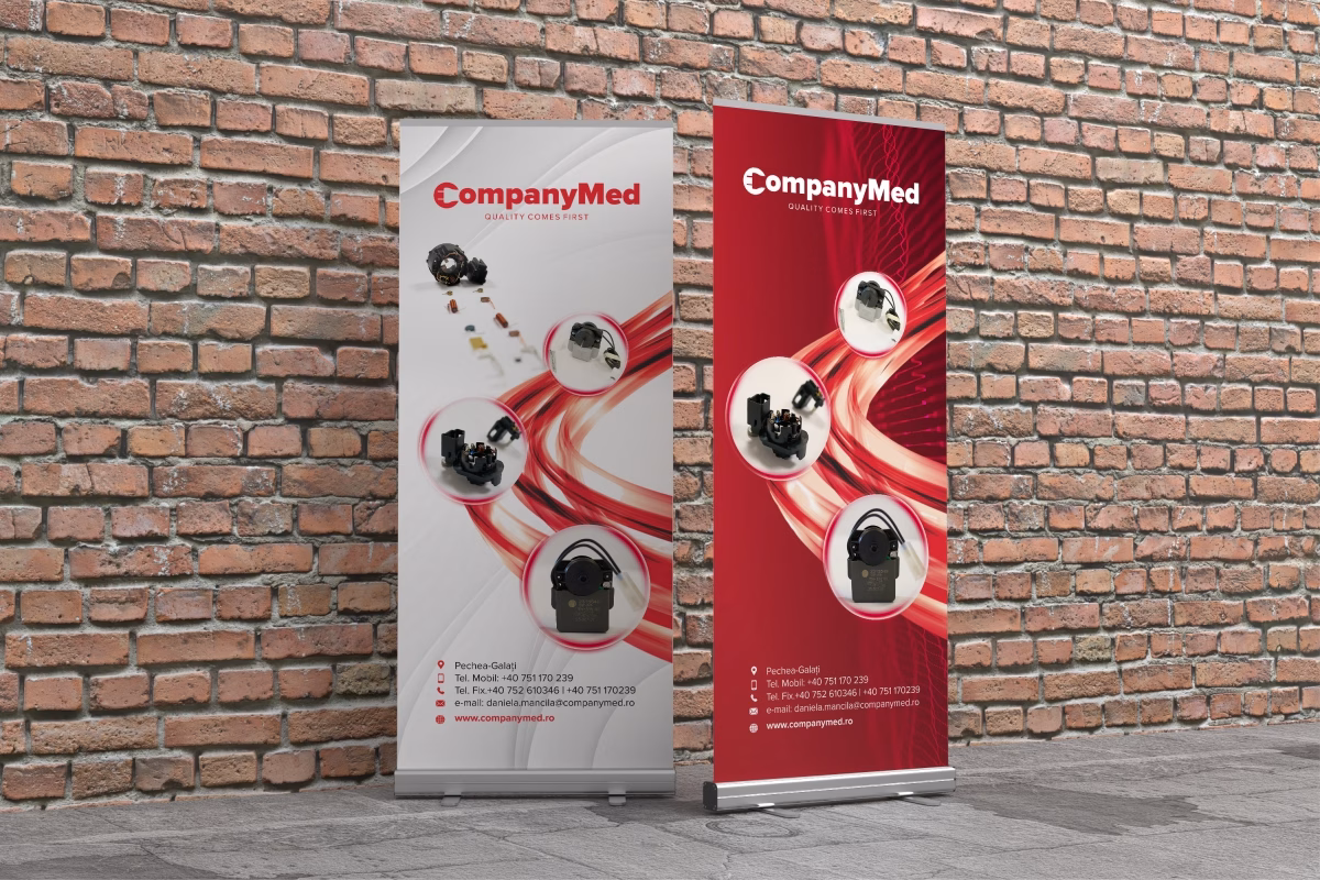
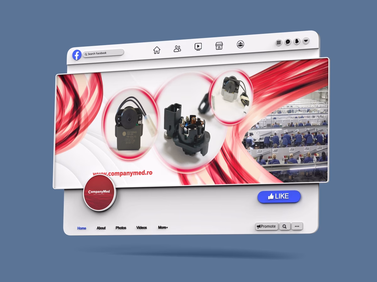
The entire visual identity was developed around a coherent brand strategy, ensuring that all materials communicate the same visual language and brand personality: technological, precise, contemporary and performance-driven. A system of modern graphic elements was carefully applied across all applications, providing both consistency and flexibility.
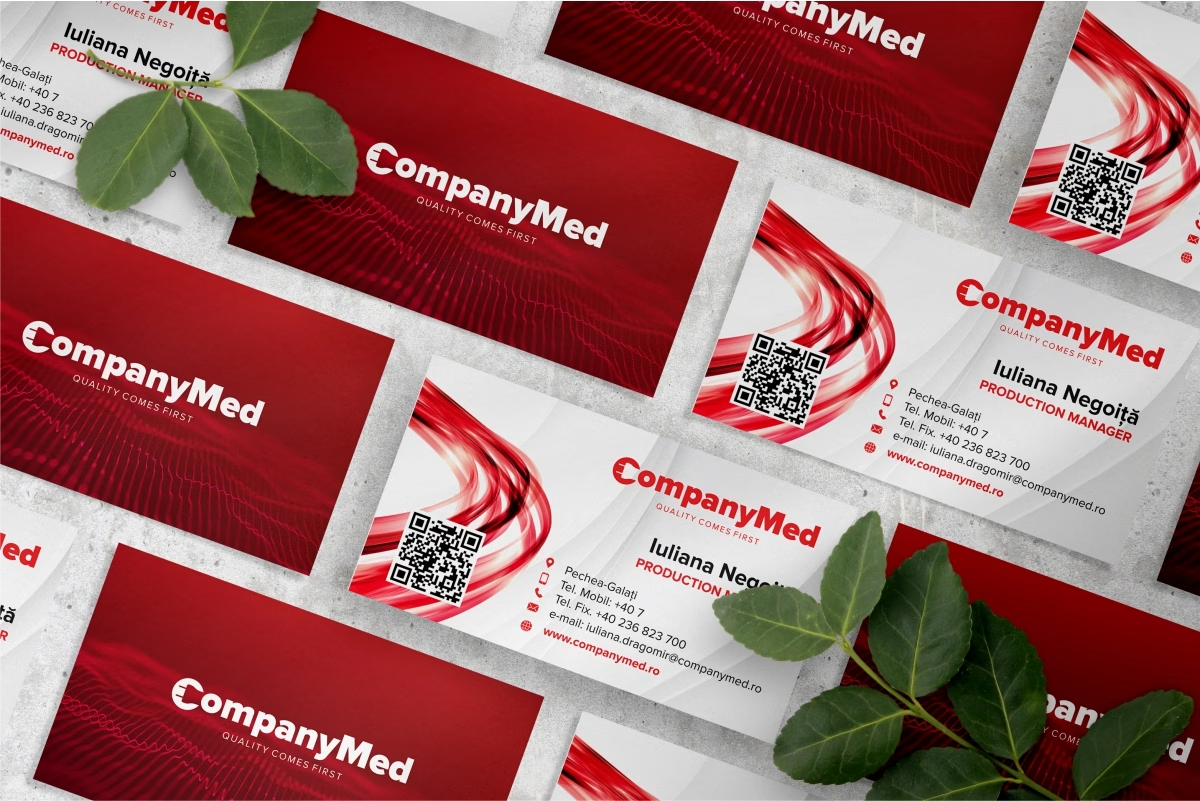
The new visual identity includes a complete range of brand materials: business cards, presentation folders, corporate catalogs, roll-up banners and signal flags. These assets support Company Med’s presence in B2B communication, trade fairs and international events.
The result is a strong, unified and competitive brand that supports Company Med’s international growth strategy and reflects its evolution from a local company into a reliable global industrial partner.